Graphing
openITCOCKPIT stores metrics (also known as performance data) so that this information can be presented as graphs. This allows developments to be viewed over an extended period, which in turn makes it possible for trends to be recognised.
By moving your mouse over the graph icon in one of the service lists, the system will display a maximum of four metrics as a graph over a period of four hours.
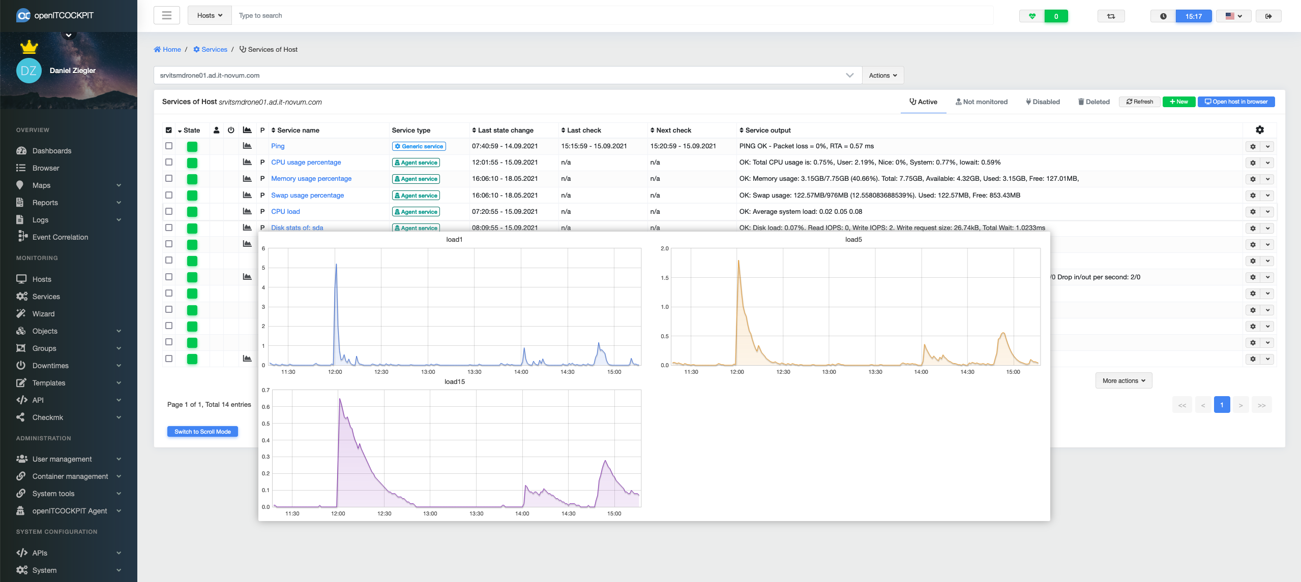
The detailed view of the service graph provides even more information and settings options.
Here the user can select the time span, the data source (metric) and the type of aggregation. If the threshold values used are transferred across in the metrics, the sections of the graph automatically change colour as soon as the threshold values are exceeded.
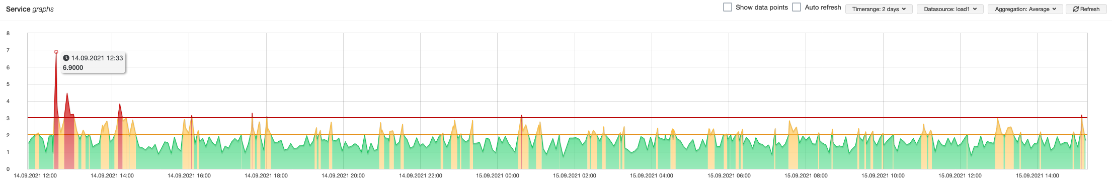
Click and drag to zoom in on a specific section of the graph.
Data aggregation
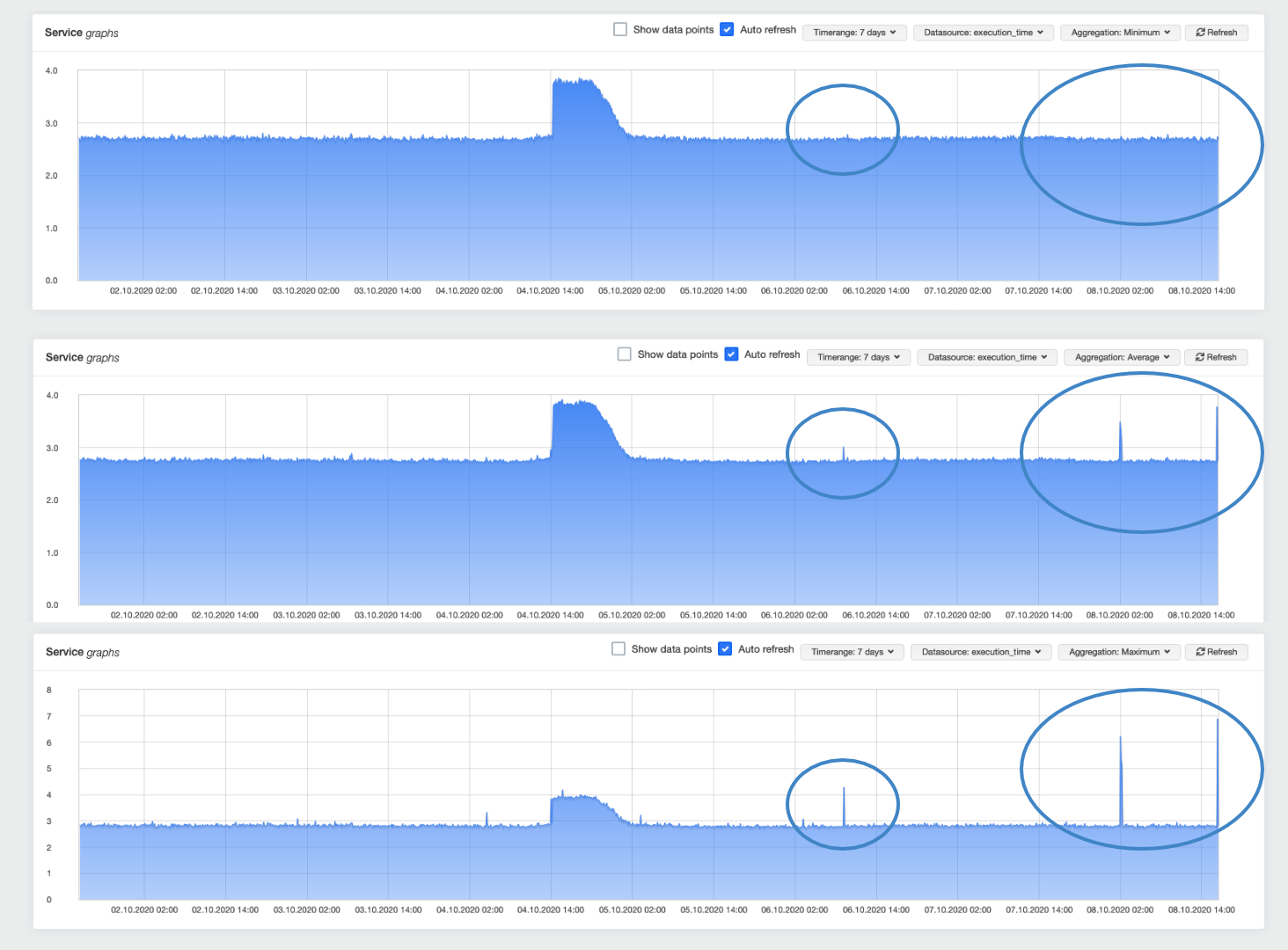
In order to display a number of data sets in a graph, the data must usually be summarised and condensed using various aggregation methods. This, in turn, can lead to inaccuracies in the graphs.
When troubleshooting, it is therefore a good idea to switch through the individual aggregations of minimum, average and maximum. In this way, short peaks can also be found. This is often especially helpful when analysing network problems.
Scaling units
Graphs are a useful tool in troubleshooting, but can quickly cause confusion depending on the unit used.
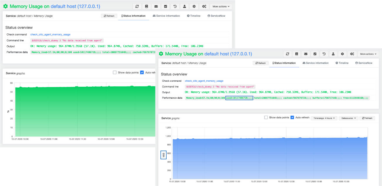
For example, a graph showing a memory usage of 1021071360 bytes is hardly legible for the average person. openITCOCKPIT tries to recognise the unit used and convert it into a more readable unit. In this case the unit 973 MiB is used.
Grafana
Grafana is a very popular open-source tool for creating your own dashboards. In addition to graphs, Grafana also offers a variety of display options.
Grafana is automatically installed with every installation of openITCOCKPIT via the GrafanaModule and is thus available out-of-the-box to users.
Automatic dashboards
openITCOCKPIT attempts to create automated dashboards in Grafana for all hosts. A corresponding panel with the associated metrics and units is created for each service.
This process is carried out every 12 hours by a cron job running in the background. The dashboards created can be viewed in the detailed hosts view.
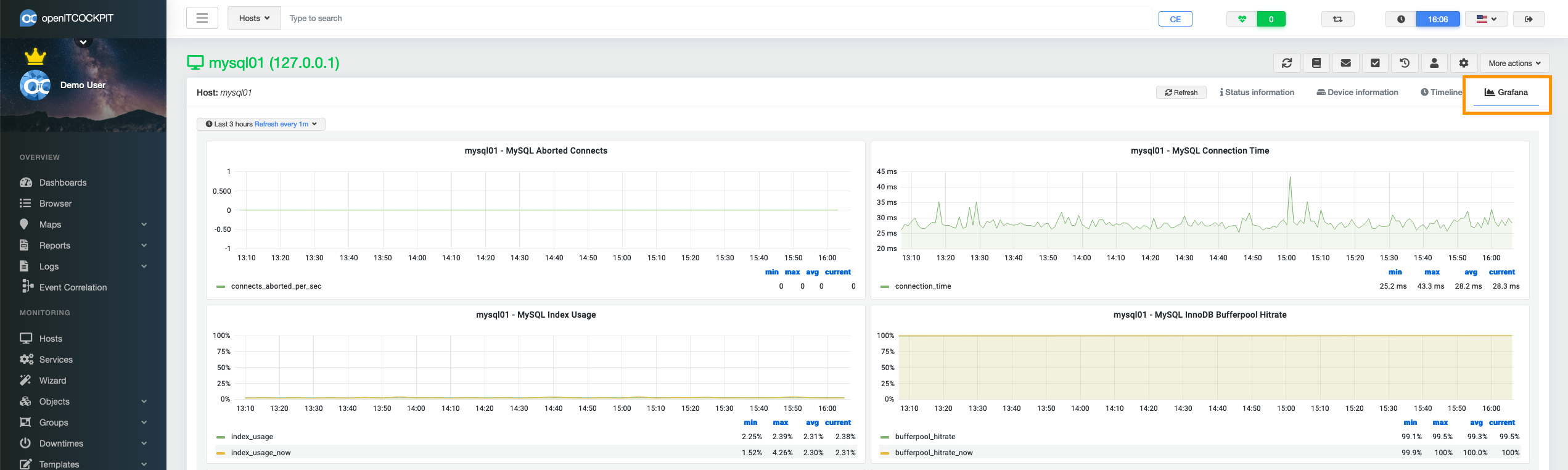
Automatically created Grafana dashboards can also be integrated as a widget in the openITCOCKPIT Dashboard eingebunden werden.
Creating custom Grafana dashboards
To offer as much flexibility as possible, openITCOCKPIT affords you the ability to create your own Grafana dashboards. An easy-to-use editor for this function can be found under Reports → Grafana.
Click on "New" to enter the editor. First, select a container and assign a name for the dashboard. You will then enter the Grafana-based editor.
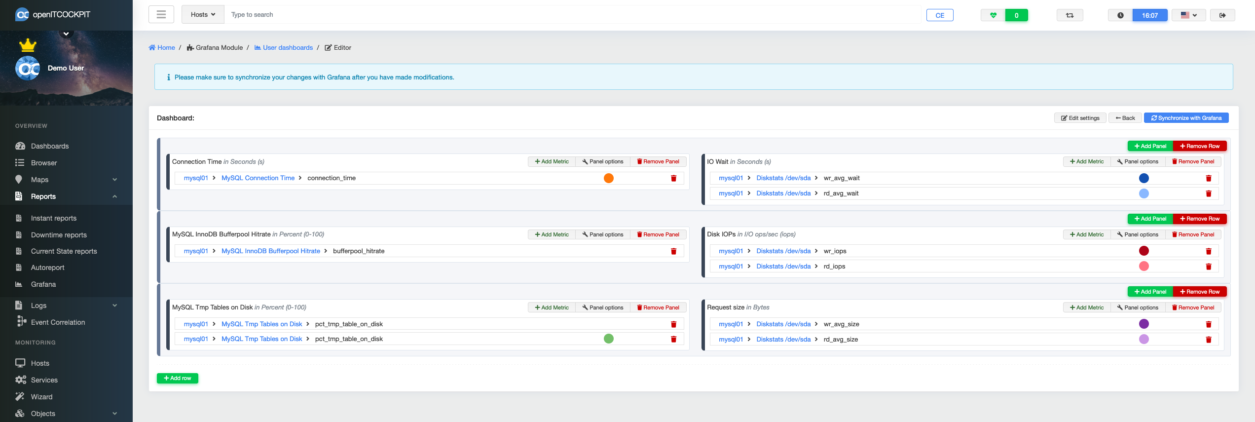
The graphs are organised in rows. Any number of panels can be added to each row. The metrics can, in turn, be assigned to the panels. Thus, the user can freely decide which units and labels are to be used and which metrics are to be displayed together.
Adding metrics is done by selecting the appropriate metric from a drop-down list.
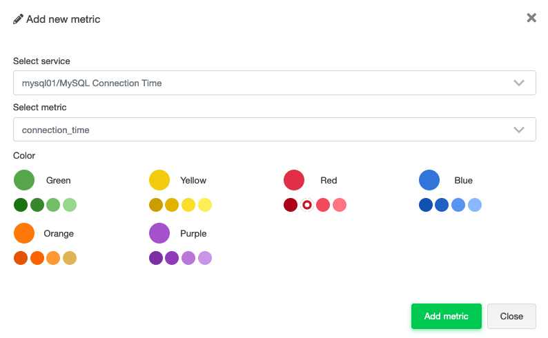
The desired colour of the curve can also be selected during this step.
The title and unit options for the graph can be defined via the panel options.
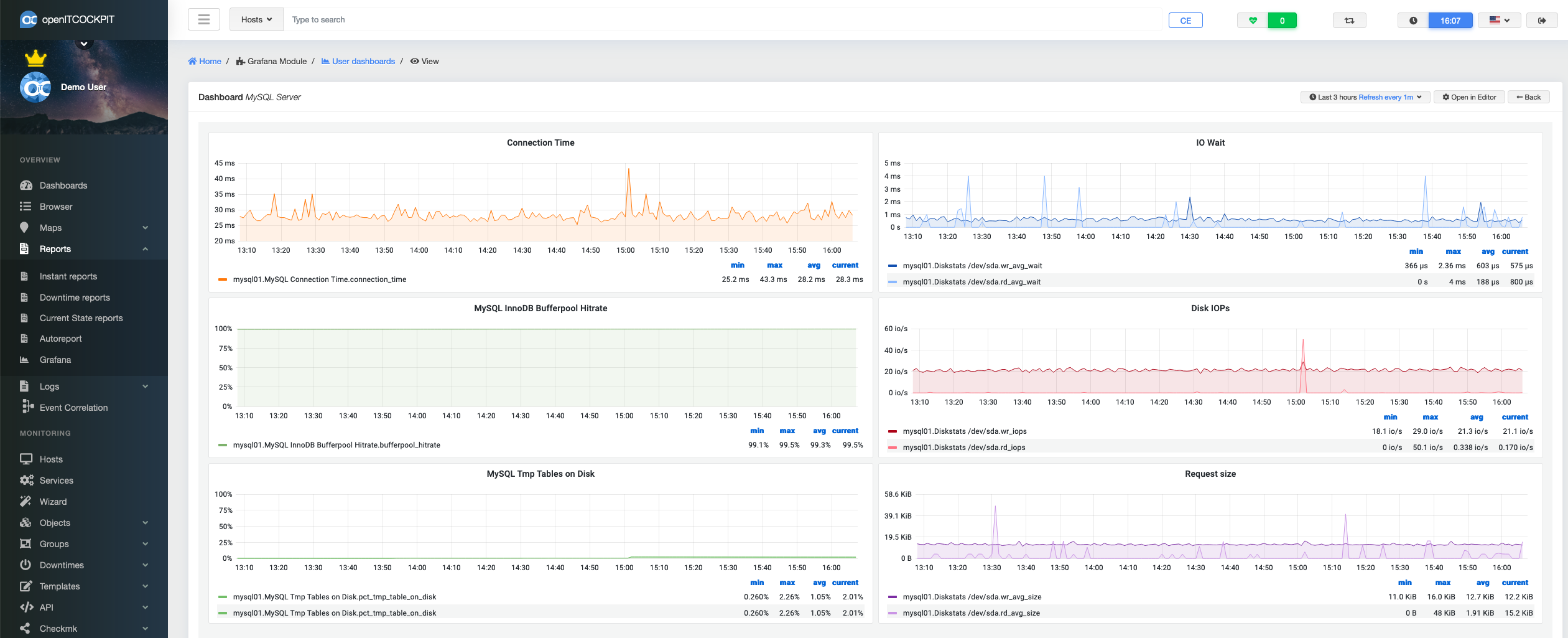
When all metrics have been added, the dashboard can be saved by clicking the "Synchronise with Grafana" button. Select Reports → Grafana again from the main menu. By clicking on the desired Grafana dashboard, this can be displayed or edited.
Custom Grafana dashboards can also be included as a widget in the openITCOCKPIT Dashboard eingebunden werden.
Configuration
Information on the available configuration options can be found in the section Graphing Backend